THE NEW LOGO
THE NEW CLAIM

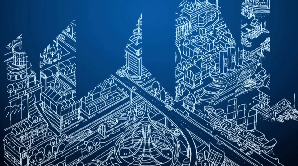
THE NEW CORPORATE DESIGN
In times of the most diverse target group-specific channels, a corporate design can no longer be static. That’s why we developed a fluid corporate design for the client that depicts the brand in a stable way and at the same time allows the necessary large design freedom.
CORPORATE TYPEFACE
A sans serif, clear font, which can also be used in capitals, ensures a diverse and large design freedom for all media, measures and formats.

COLOUR
The basic colours have been retained. A new accent colour has been added. The mint green provides a fresh new look that also picks up on the claim “Sustainably healthy” in terms of colour.

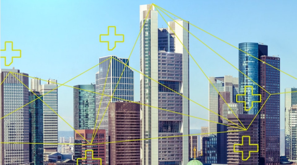
ICONS
In addition to the straightforward, clear typeface, the icons chosen are also concise. They work quickly, clearly and transparently.
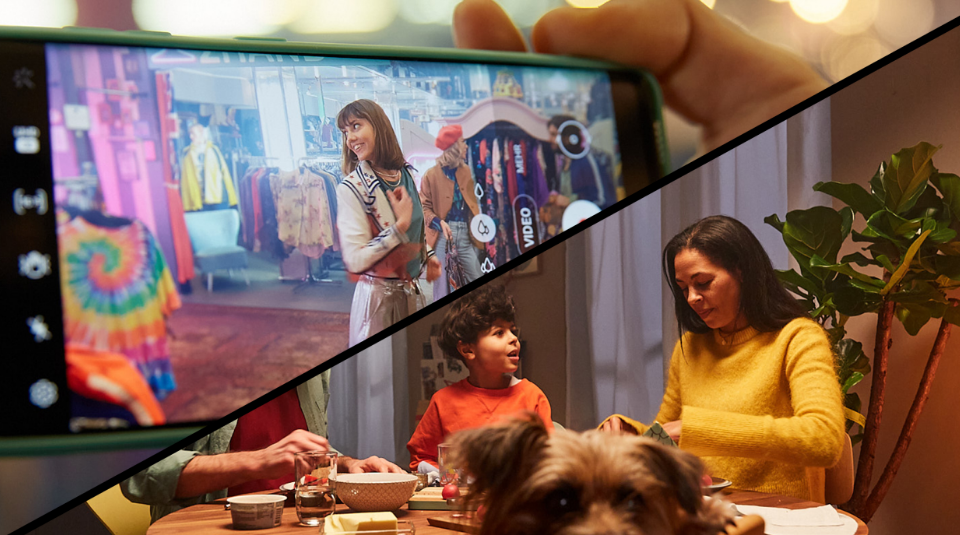
IMAGERY
Natürlich, echt, aus dem Leben. Unsere Bildwelt spiegelt den Alltag unserer Versicherten in allen möglichen Lebenssituationen.

EXAMPLES: THIS IS WHAT IT LOOKS LIKE


With around one million policyholders, Mobil Krankenkasse is one of the financially strongest and most efficient providers of statutory health insurance in Germany.